Brightcast

This is a UI/UX case study created as part of my design portfolio to explore how weather data can be transformed into a lifestyle tool for daily decision-making.
UI/UX Designer / Product designer
User research, Wireframes, Prototypes, Mockups and Testing
BrightCast is a weather app designed for millennials and Gen Z users that transforms everyday forecasts into engaging, motivational content. It blends real-time weather updates with curated activity suggestions and positive messaging, offering motivational content and curated activity suggestions that align with current weather conditions. At its core, Brightcast aims to foment outdoor exploration whenever possible, while also celebrating mindful indoor alternatives on less favorable days. Whether you're looking for a sunny hike or a cozy café escape, Brightcast becomes your companion for intentional, mood-aligned living.
Enhance User
Experience
Encourage
Daily Use
Recommend
Tailor Activities
Typical weather apps are transactional: check the forecast, exit the app. But what if the weather could inspire action instead of limit it? How might we design a tool that not only informs but also motivates users to plan their day with intention — rain or shine? The core idea was to create a personal planner disguised as a weather app, blending real-time weather with curated activities to foster both outdoor exploration and indoor balance.

• Foster Healthier Habits: Encourage outdoor activity through timely suggestions based on weather and energy levels.
• Deliver Personal Relevance: Let the app adapt to the user over time, offering suggestions that resonate with their preferences.
• Uplift and Inspire: Introduce emotionally intelligent features like motivational quotes and vibrant visuals to elevate everyday experiences.

• Mixed-method user research (12 participants: surveys, interviews)
• Focus on emotional connections to weather, day-planning habits, and mobile app routines
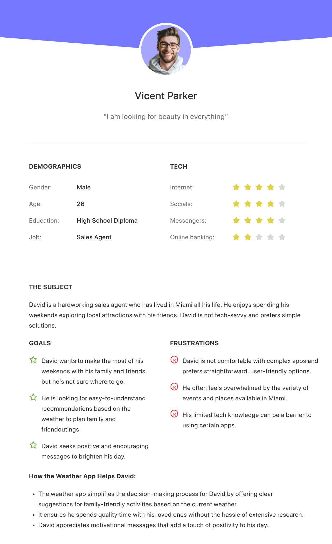
Persona: David — Family-Oriented, Tech-Shy
“I want to take the kids somewhere fun — but I don’t have time to scroll or guess what works.”
• Needs: Simple, tailored suggestions
• Problem: Overwhelmed by options, unsure what’s feasible given the weather
Persona: Grace — Young Professional, Explorer
“I love discovering new places, but sometimes I just want an app that gets me without overthinking it.”
• Needs: Variety, mood-based planning
• Problem: Wants inspiration, not more decision fatigue
Often feels overwhelmed by the variety of events and places available.
Prefers personalized recommendations rather than generic listings.
Prefers straightforward, user-friendly options.
Clear Navigation: Ensure the navigation within your app is intuitive and straightforward. Users should easily find their way around your app.
Categorize Activities: Group weather-based activity recommendations logically. For example, separate outdoor activities from indoor and culinary options.
Priority Content: Highlight the most relevant and engaging content. Just as Google should understand your most important web pages, your app should emphasize the activities or information that are of primary interest to users.
Logical Hierarchy: Create a logical hierarchy for your content. Users should be able to browse from general categories to specific activity details easily.
Internal Links: Implement internal links where relevant, guiding users to related content or activities. For instance, if a user is exploring outdoor activities, provide links to related indoor options when weather conditions are less favorable.
Clear Content Organization: Organize your app content neatly, just like you'd organize content on a website. Your app's content structure should match the logical flow that users expect.

Typography:
• SF Pro for headers to echo the Apple-native look and reinforce legibility
• Rubik for subheadings/body text, adding a slightly friendlier tone without compromising clarity
Color System:
• Used vibrant, saturated hues to reflect positive energy and counteract gloomy weather days
• Applied color sparingly in CTAs and mood accents, avoiding overwhelming the interface
Illustrations & Icons:
• Custom-drawn, cheerful icons (sun, umbrella, coffee mug, etc.) introduce personality
• Weather visuals double as mood indicators, subtly reinforcing tone
Microinteractions:
• Card hover and swipe states include soft animations to make interactions feel smooth and intentional
• Motivational quotes fade in subtly on load — adding delight without disrupting flow

One of my key references was the Apple Weather app — widely known for its clean interface, bold typography, and intuitive hierarchy. By borrowing familiar interaction patterns and spatial layout (e.g., vertically stacked forecast zones, large high-contrast temperature displays), I ensured that users could quickly orient themselves in Brightcast without a steep learning curve. This approach taps into mental models users already have, which boosts usability and reduces onboarding time.
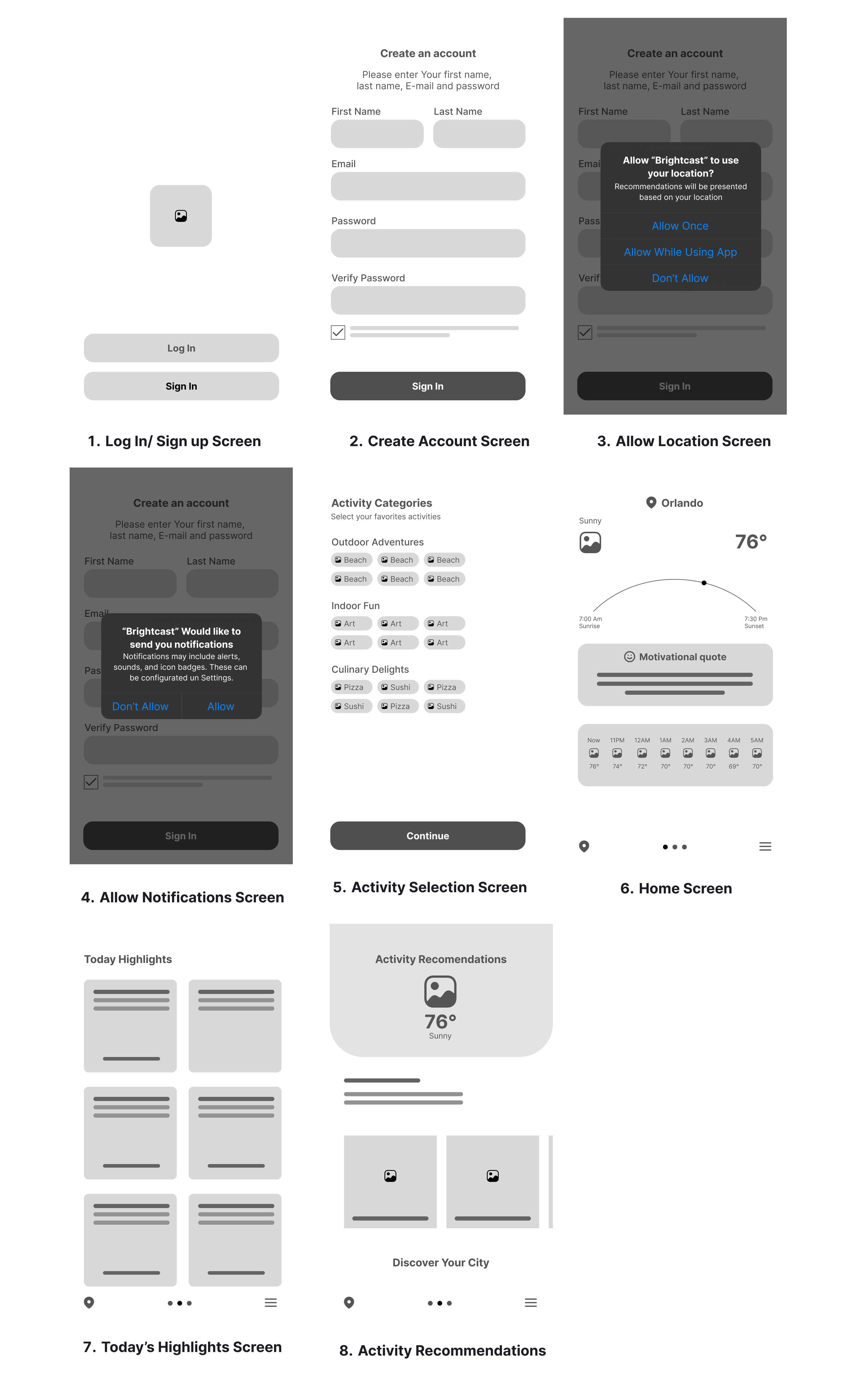
• Top Module: The home screen greets users with a motivational quote and a quick-read weather summary, using bold type and icons.
• Main Modules: Horizontally scrollable activity cards, divided into weather-aware categories (Outdoor, Indoor, Culinary).
• Card Tags & Filtering: Each activity card includes subtle tags to help users filter and scan effortlessly — a system inspired by Spotify’s category chips and Pinterest-style discovery.

• 67% of participants said they would be more likely to do outdoor activities with subtle nudges or suggestions
• 75% wanted indoor alternatives readily available without searching if weather changed
• Users viewed motivational content as a “pleasant surprise” — something that gave them pause and a smile
• Clear icon-based navigation increased confidence and reduced bounce rates in tests
8 users (ranging in age from 21–41) completed tasks and reflections.
Key Results:
• 100% rated the app “easy to navigate”
• 67% said the motivational quotes positively impacted their mood
• 83% said they'd prefer this over their current weather app if it had more personalization
Iteration Outcomes:
• Added “Quick Glance” tiles for weather + activity
• Reorganized Indoor content into creative sub-categories (e.g., cozy, productive, playful)
• Improved microcopy for clarity and empathy

AI-Driven Personalization:
• Leverage user behavior, weather patterns, and time-of-day data to offer tailored nudges
• Learn from user interactions to fine-tune future recommendations
• “Hey BrightCast, surprise me!” becomes smarter the more you use it
Gamification Layer
• Introduce streaks for doing outdoor activities
• Unlockable content like “Rainy Day Recipes” or “Mood Boosters” based on app use
• Social sharing for favorite suggestions
Calendar & Sync
• Seamless integration with iOS/Android calendars to turn suggestions into real plans
• Notifications based on micro-climate alerts and opportunity windows (“Golden Hour in 1 hr — perfect for a walk!”)
Brightcast challenged me to rethink how we engage with everyday tools like weather apps — not just as sources of information, but as emotional, habit-forming companions. Through user-centered design and thoughtful storytelling, I crafted an experience that promotes intentional planning, outdoor activity, and emotional well-being — while never ignoring the value of a cozy day indoors.This project showed me the power of blending function and delight, and it deepened my approach to interaction design. I now think beyond usability to ask: How can this product become a meaningful part of someone’s day? That mindset guides every project I take on, especially in environments where user connection is just as important as conversion.
.png)
