This project was designed and developed as part of my work with Juniper Branding.
Role & Responsibilities
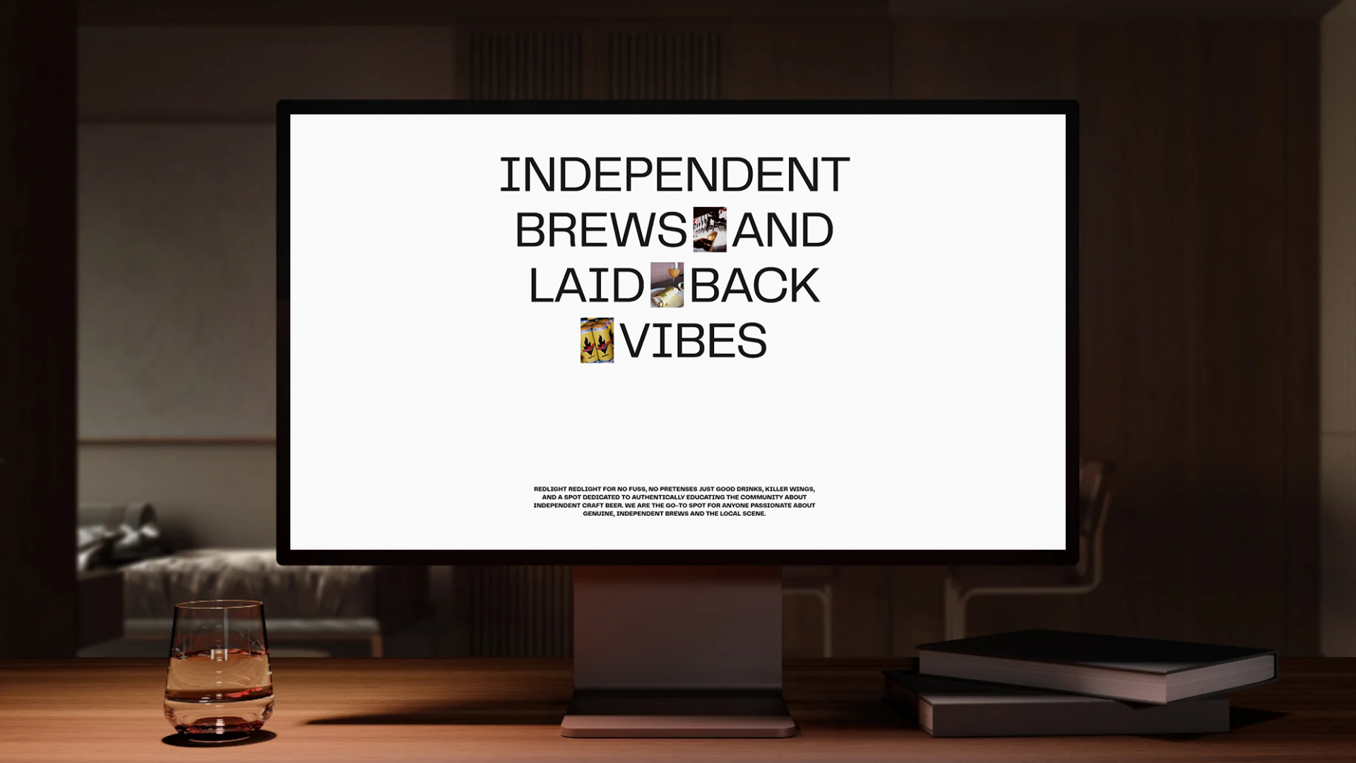
Web Designer / Webflow Developer UI/UX Design, Research, Wireframes, Prototypes, GSAP Animations Responsive Webflow Development
Problem/Challenge Statement:
Red Light Brewpub did not have a website before this project and relied mainly on Instagram and Facebook for updates and menus. They needed a central place where visitors could quickly find information, explore the menu, and get a sense of the brewpub before arriving. The goal was to create a site that felt energetic while staying easy to use across desktop and mobile.
The challenge was to translate an already bold and expressive brand into a clean, functional digital experience without redesigning the identity itself. The website needed to feel lively and authentic, while improving usability, responsiveness, and engagement. Additional challenges included organizing complex menu content, avoiding static PDFs, and creating interactions that felt intentional rather than decorative.
Project Goals
1
2
3
Develop a strong digital presence
Create an engaging user centric experience
Bring the brewpub energy online
Proposed Solution
Clear engaging user-focused services presentation
The project focused on turning Red Light Brewpub’s personality into a real web experience people could feel before stepping inside. The brand already had a strong presence, so the goal was to stay true to it while building a site that felt fun, clear, and easy to use across devices.
Key solutions included: • UI design and research inspired by local and international bars breweries and pubs to understand how people explore menus and venues online.
• Designing and developing a fully responsive Webflow website with custom layouts and smooth GSAP interactions that feel natural and purposeful.
• Ensuring scalability and performance by building a Webflow site optimized for responsiveness, SEO, and future content growth.
What we set out to accomplish at the beginning of the project
• Creating a first website for Red Light Brewpub that made it easy for people to find menus, events, and key information.
• Keeping the experience aligned with the existing brand while translating its energy into a clear and usable digital layout.
• Managing dependencies like content and evolving project directions during tight deadlines.
Process
1. Define & Research
Since Red Light Brewpub did not have a website before, the process started with understanding the space through research rather than existing digital references. I explored local and international bars, pubs, and breweries across Instagram, Google, and real world examples to understand how similar places present menus, events, and atmosphere online.
This research helped identify what worked, what felt cluttered, and where opportunities existed to create something more intuitive. The goal was to translate the energy of the brewpub into a clear web experience while staying true to the existing brand and avoiding anything that felt forced or overdesigned.
Process
2. Design
The design phase started with structure first. I mapped out the main pages and user flows to understand how people would move through the site, especially visitors looking for menus, events, or basic information before coming in. Early layouts focused on clarity and speed so users could find what they needed without friction.
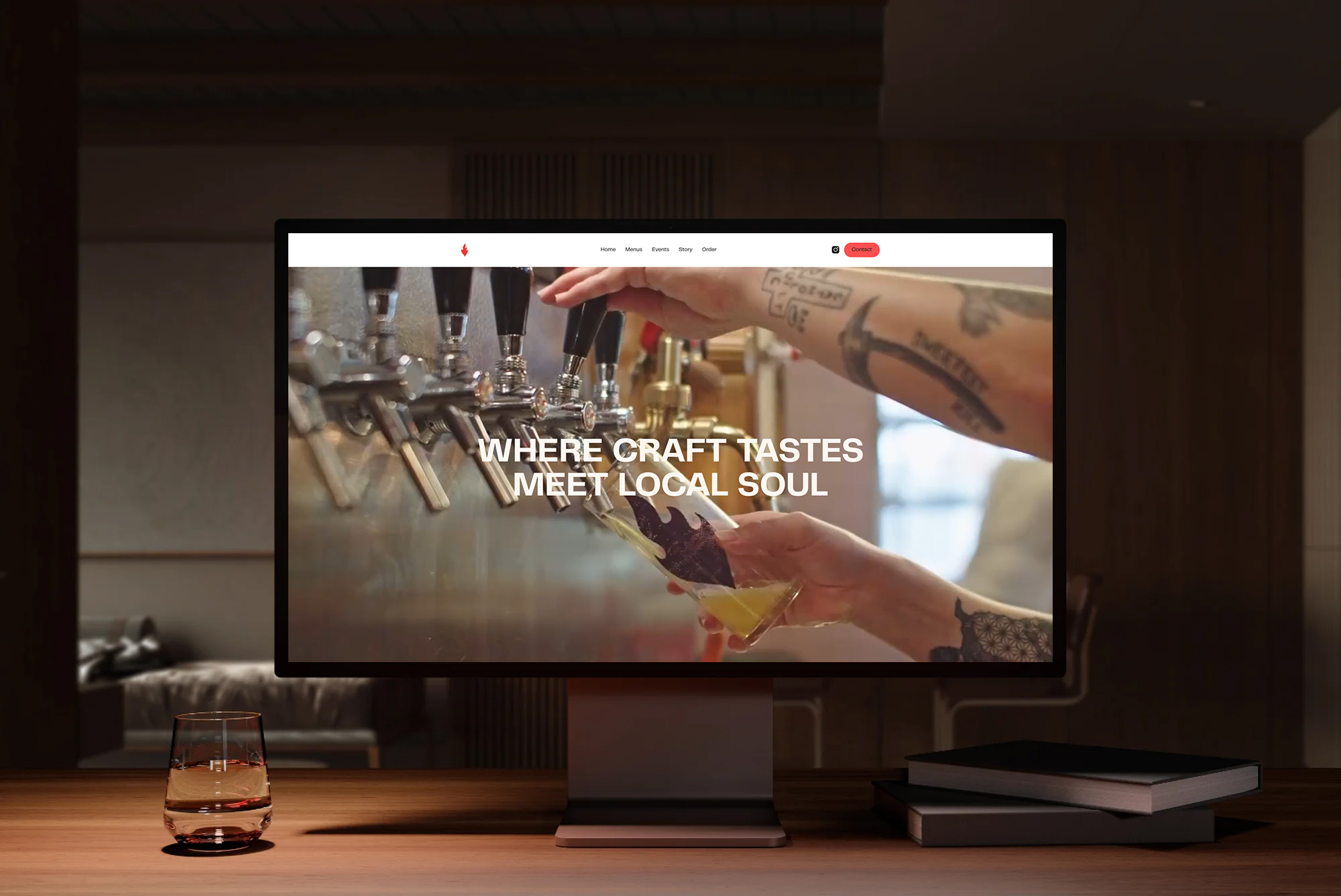
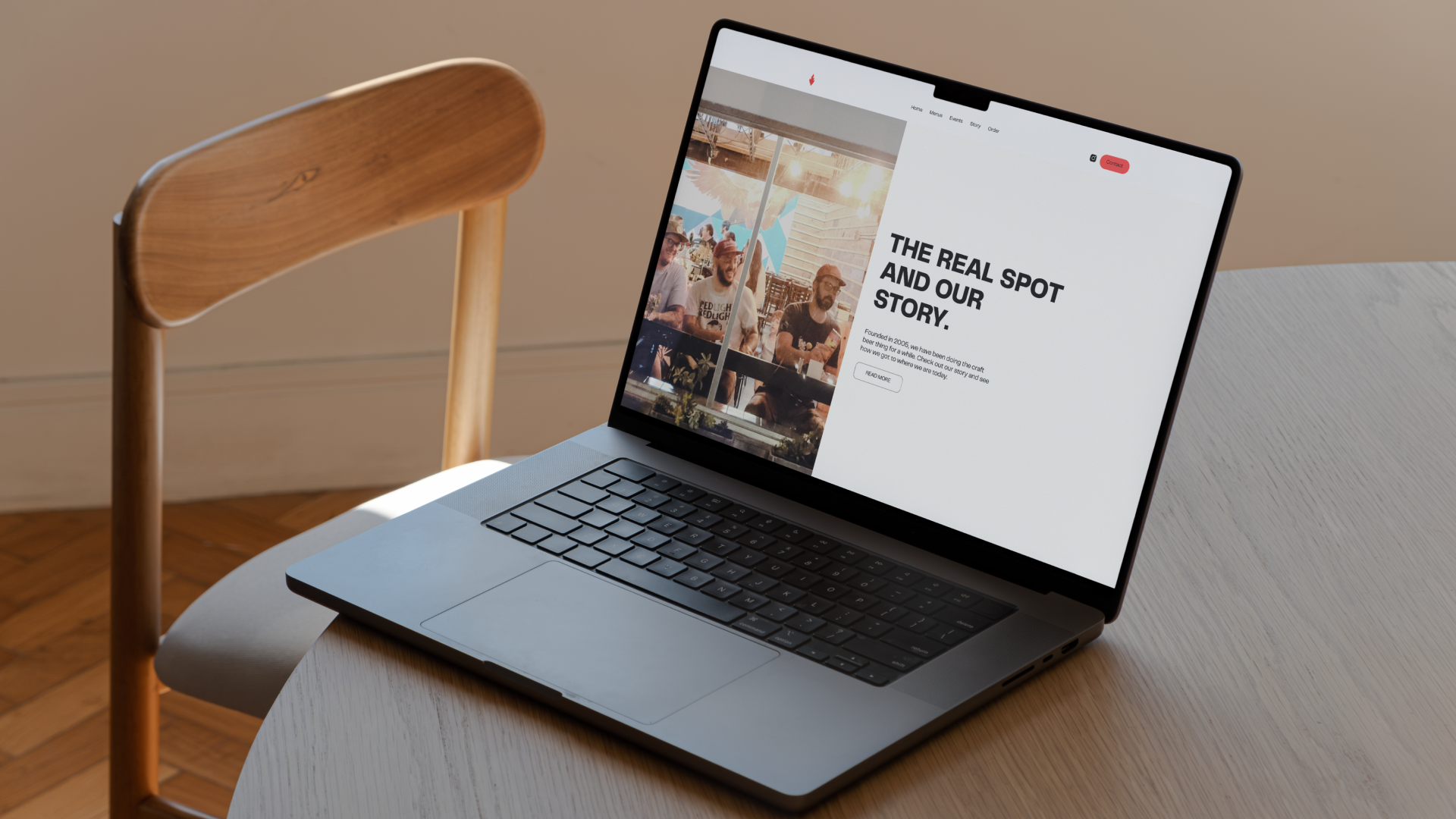
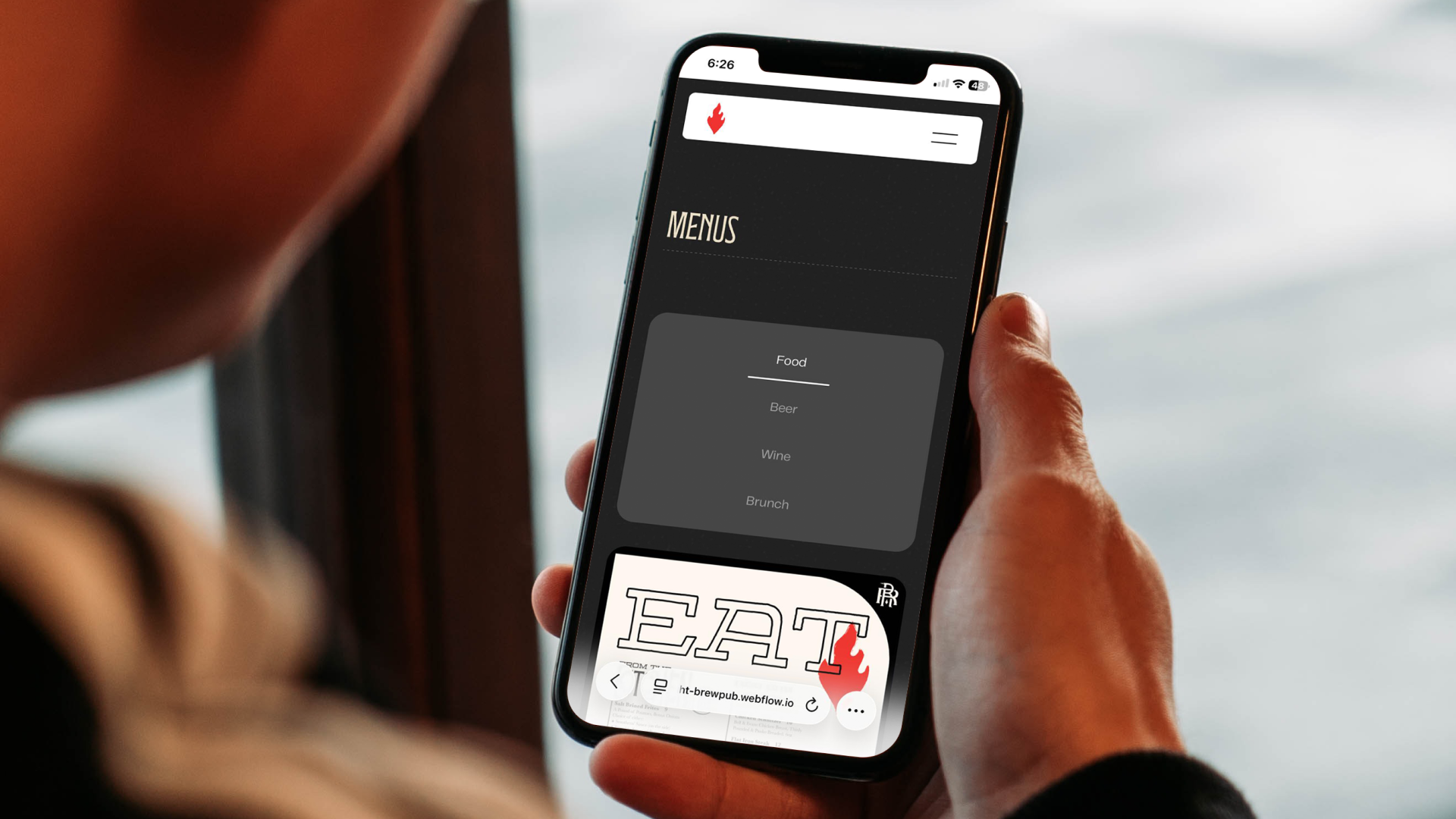
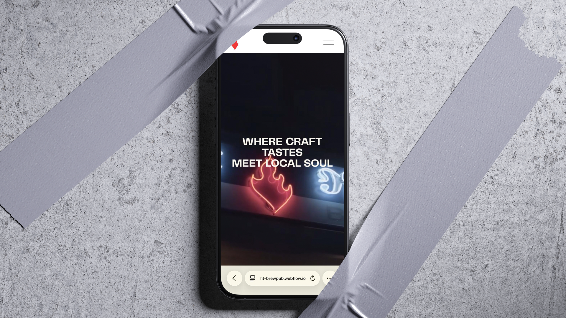
As the visual direction evolved, I explored multiple layout and interaction ideas while staying aligned with Red Light’s existing brand. Since the logo and identity already had strong personality and detailed elements, the goal was not to redesign the brand but to support it. I studied how the brewpub used fire imagery and iconography in their visuals and proposed using the flame asset as a navigation icon, showing how it could live naturally across the site. Menu design became a major focus during this phase. After testing traditional layouts and PDF style menus, it was clear they felt static and disconnected from the energy of the space. I proposed a tab based menu interaction that allowed users to quickly switch between food, beer, wine, and brunch without leaving the page. This approach made the menu easier to explore and became one of the strongest features of the site, receiving positive feedback from both the team and the client. To bring the experience to life, I also edited and adapted an anniversary video provided by the restaurant and proposed it as the hero section. This helped set the tone immediately and made the site feel active and welcoming, more like stepping into the brewpub itself rather than scrolling a static page.
Throughout the design process, every interaction was intentional. Button animations were designed to feel light and responsive, inspired by the motion of lifting a drink. The goal was not to overwhelm the user, but to add subtle moments that made the experience feel lively, playful, and true to the personality of Red Light.
Process
3. Development in Webflow
Once the design direction was finalized, I moved into building the site in Webflow with a strong focus on structure, responsiveness, and performance. Every page was developed to work smoothly across desktop, tablet, and mobile, ensuring a consistent experience across devices. The layout system was built to remain flexible, allowing future updates without disrupting the overall structure.
Accessibility was considered throughout development, following WCAG 2.1 Level AA accessibility standards. This included readable typography, proper color contrast, clear navigation patterns, and accessible interaction states to support a wide range of users.
Given the nature of the business, an age verification popup was implemented to ensure visitors confirm they are 21 or older before accessing the site. The experience was designed to be clear, fast, and non intrusive, while still meeting industry requirements for alcohol related websites.
Motion and interaction were added intentionally using GSAP. Animations were kept subtle and purposeful, helping guide attention without distracting from the content. Navigation interactions, button interactions like the effect that is filling like a drink would, and transitions were designed to feel smooth and responsive, reinforcing the lively energy of the brewpub while keeping the experience intuitive and easy to use.
The final build balanced personality with usability, resulting in a website that feels active and welcoming while remaining accessible, compliant, and ready to grow.
Home Page:
Menus Page
Weekly Events Page:
Takeaway
This was one of those projects that reminded me why I love doing this work. Even though Red Light is a brewery, the goal was never to feel intimidating or exclusive. It was about creating a space that felt welcoming, friendly, and social, the same way the brewpub feels in real life. Like a place you go to relax, talk, laugh, and enjoy a drink with people around you.
Working on this site felt personal. I have spent a lot of time in spaces like this, attending design meetups, social events, and local gatherings, so designing for a place built around community felt very close to my heart. It pushed me to think beyond layouts and screens and focus more on emotion, energy, and flow.
This project taught me how much small interactions matter. From the way the menu opens, to how buttons react, to how motion can feel playful without being distracting. It reinforced that good digital experiences do not have to be complicated. They just need to feel natural, inviting, and made with intention.
Most of all, it reminded me that when a project is genuinely fun to build, that feeling translates directly to the people using it.
Credits:
Project Manager: Jennifer Bentson. Juniper Branding Team Agency: Juniper Branding


.png)